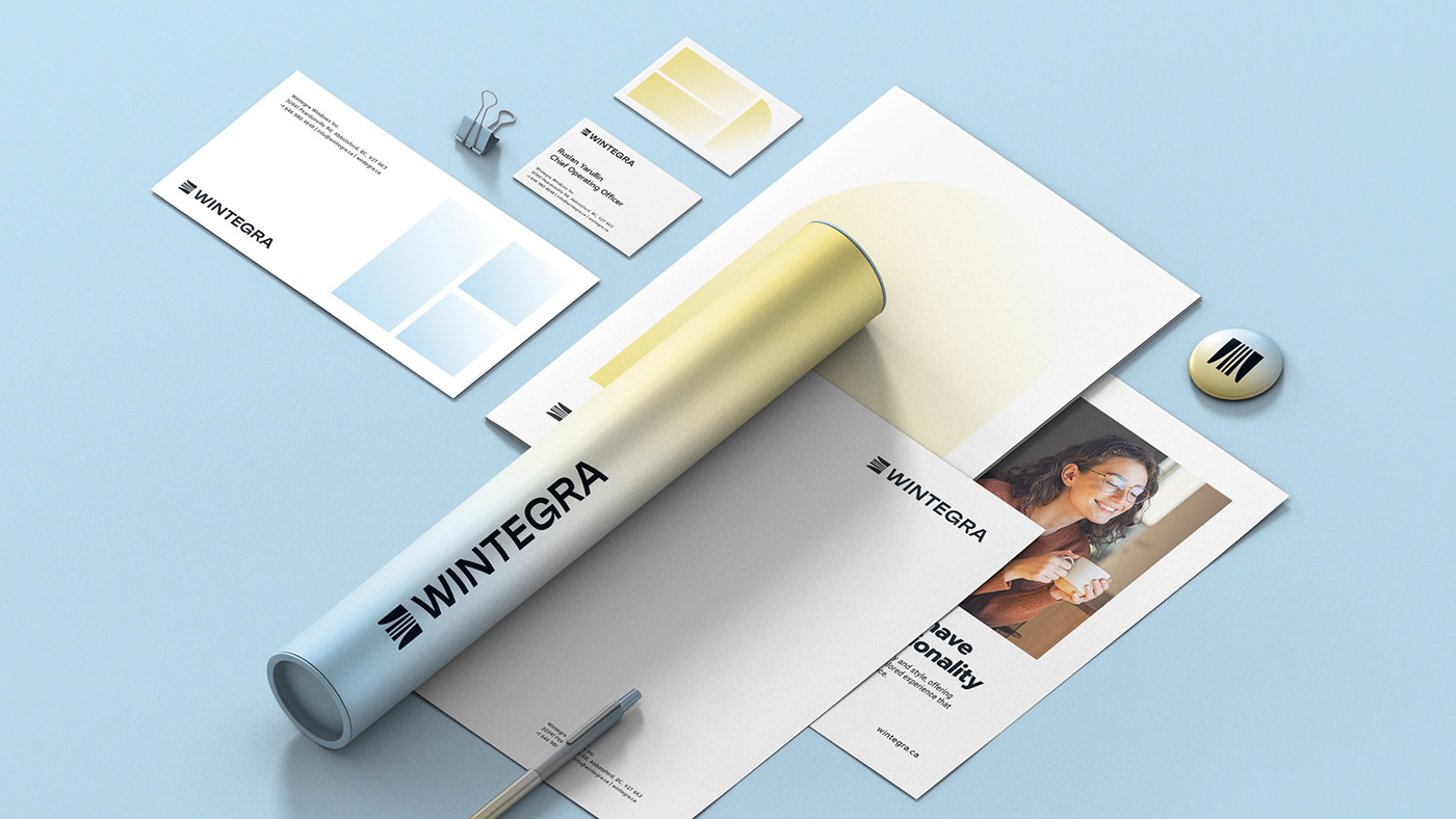


Wintegra / Brand Development
Task. Wintegrta is a company specializing in the manufacture, sale, and installation of high-quality vinyl windows in Vancouver. The company's windows seamlessly combine functionality, great design, and superior thermal performance. Their energy efficiency not only helps keep the heat in rooms, reducing heating costs, but also prevents noise intrusion, provides durability, and fire resistance to the structure. They effectively block the cold and the heat, creating a cozy home all year round. In addition to these characteristics, Wintegrta stands out for its exceptional speed of operation compared to its competitors. The challenge was to emphasize the benefits of both the product and the service, with a particular focus on the speed of operation.
Solution. A brand was developed, including both verbal and visual identity components. The brand strategy aimed to position Wintegrta as a progressive company delivering energy-efficient windows with the fastest service in British Columbia. The brand concept, “Speed of Light,” emphasizes the company's ability to serve customers so quickly that it seems like an instant. The imagery effectively communicates the brand's core message while emphasizing a close connection to the theme of windows, through which light streams in to create indoor ambience. The brand's graphics revolve around gradient fills, symbolizing speed and dynamics. The window shapes and frames used in the design evoke the company's products, making each carrier look like a miniature window. The brand colors - blue and light yellow - evoke associations with warmth and light, sky and sun, energy and purity, enhancing the visual impact and memorability of the brand.